itsCasper

Casper primarily works with Apple products and comes from an agency background, making these clients his preferred focus as he deeply understands their environment and the prevalence of Apple products within it.
This guided the selection of interview participants: CEOs, founders, and managers aged 35-65, based in the GTA, who utilize Apple products throughout their organizations.
Persona
Empathy map
User journey

Opportunities are notable around communication, importance of testimonials on the site and remote support as a key service to highlight that will be brought into the ideation phase.
How might we?
Sitemap
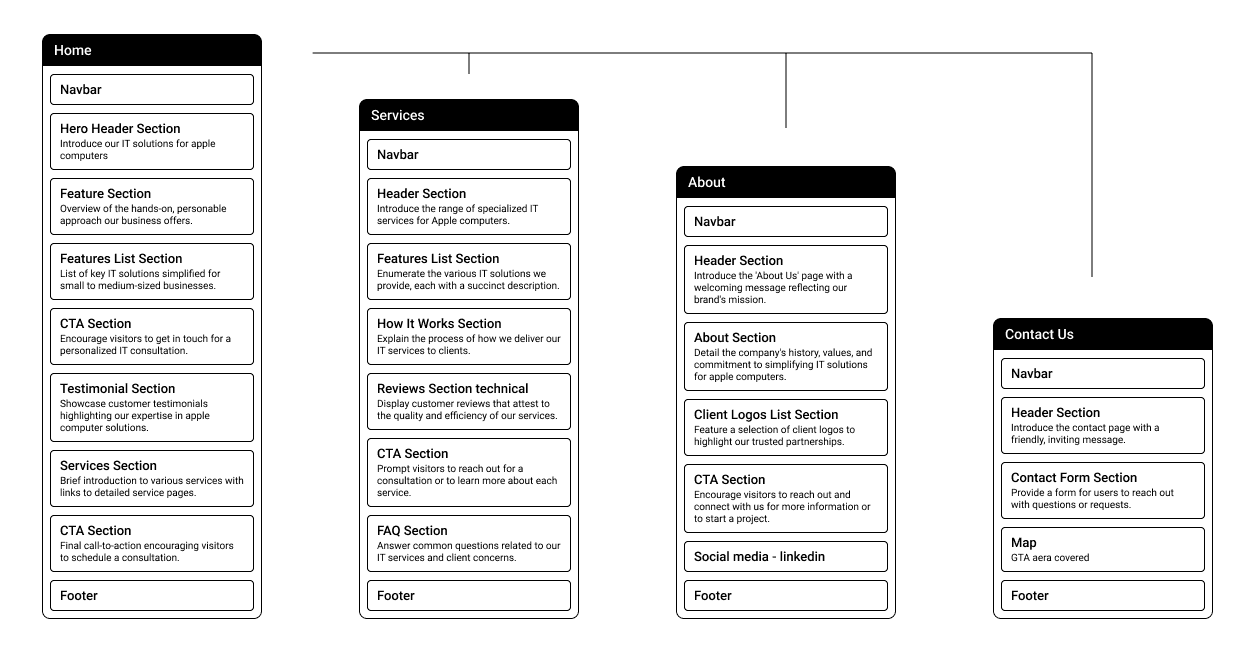
Wireframe
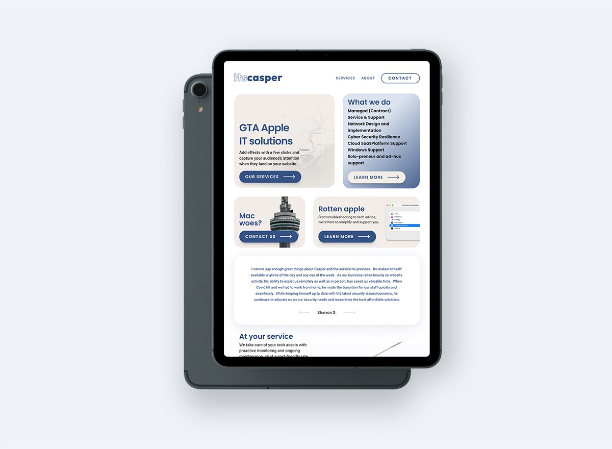
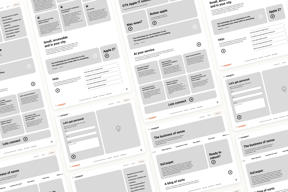
The client’s preference for a bento-style design made the wireframe straightforward, though limited content left significant empty space. This created an opportunity to highlight the value of IT support by weaving in Canadian SMB and computer-related stats.
Branding
Identity
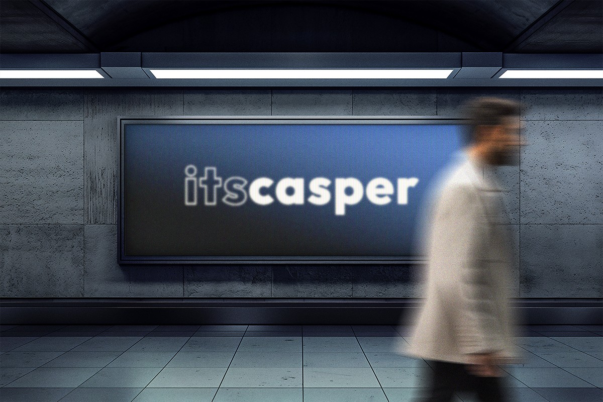
When I asked Casper, what is your offering, he answered “IT Solutions”. Shortened down to 'ITS' it segue perfectly into his name, Casper, which is uncommon but has a friendly association due to a certain cartoon ghost. itsCasper flowed together as one, not two words so a logotype was in order to merge it all together harmoniously.
Tones
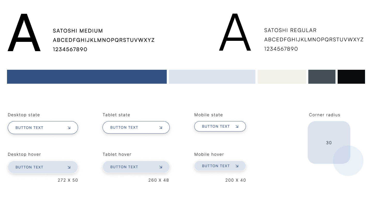
Blue was the client's preferred color but I warned away from it due to Casper Mattresses branding and not wanting to be confused with them. I ran from blue, and chased other hues and tones around until I realized blue was the right color for the job. It represents calmness and responsibility, which you want in your IT solutions. The light blues are refreshing and friendly, much like Casper and lastly beige, evokes a sense of stability and reliability.

Chambray
#355284
Soft peach
#F2EDE7
River bed
#435058
Link water
#DBE3EF
Woodsmoke
#0A0D11
Mid fid
Design
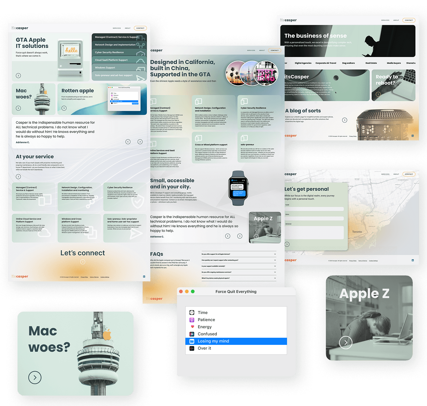
This is where we explored using a language and tone that was comedic, local and unexpected. This stark contrast to competition in the area was used as a tool to differentiate and delight visitors so that they would feel more at ease communicating with the client.
Usability feedback
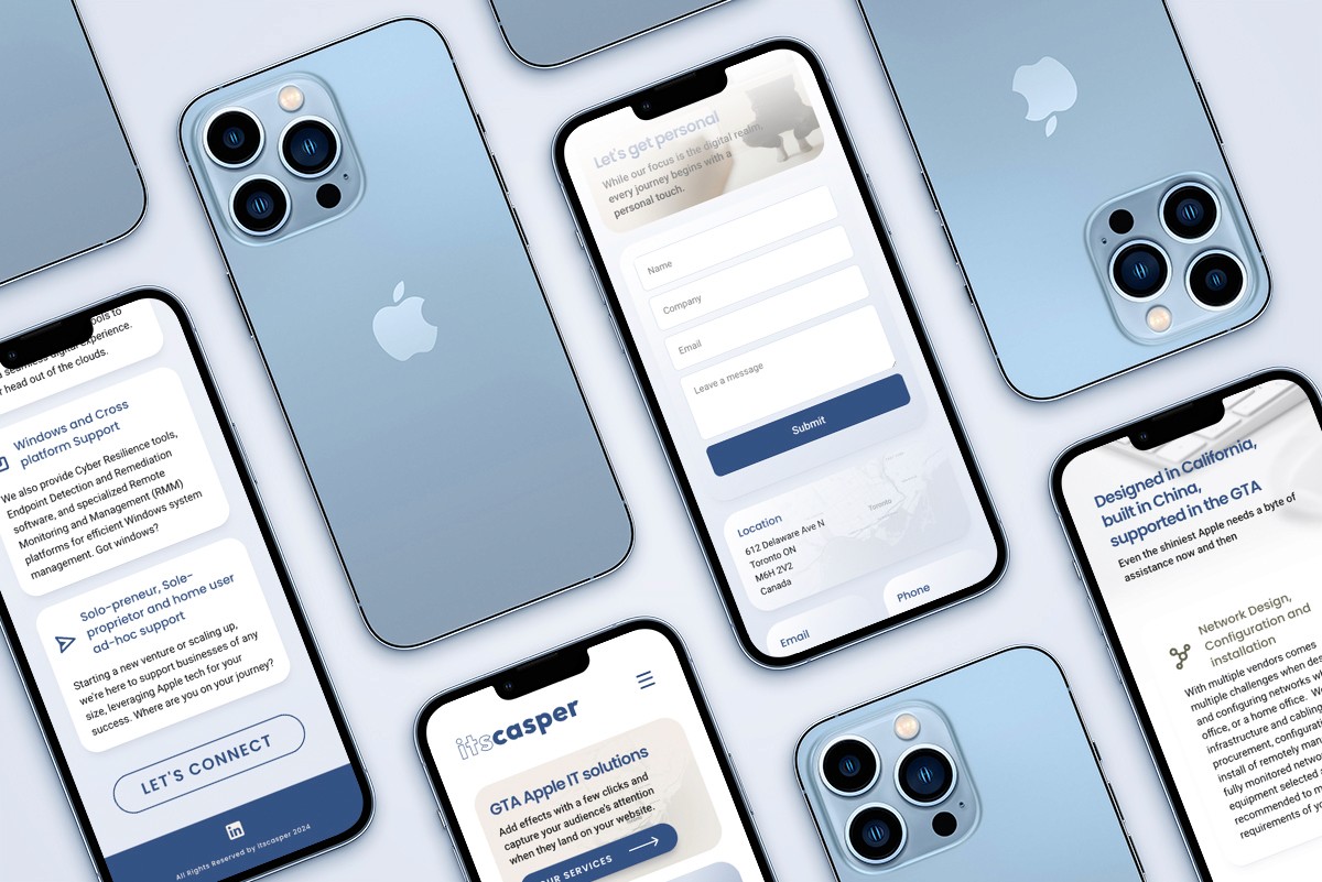
The primary feedback from the usability study focused on ensuring consistency in call-to-action (CTA) copy. A lot of the creative ideas for the CTAs were found to be confusing and users didn’t know what was what and where they lead.
Font sizes on mobile devices also needed to be adjusted and overall the background needed lightening by removing elements and revisiting the color palette, which was in beta and eventually would become blues. Lastly the contact page layout felt disconnected from the design language of the rest of the website.
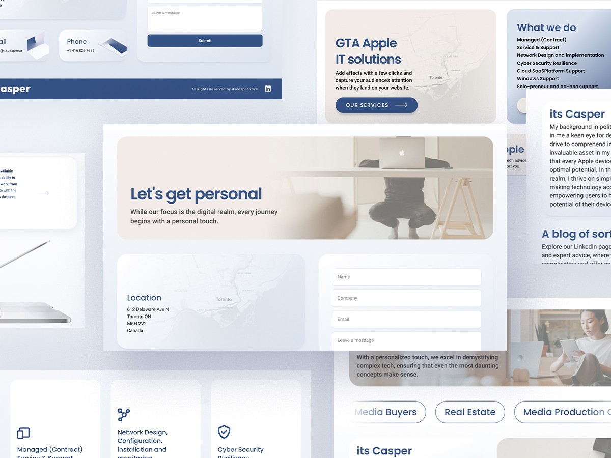
Final
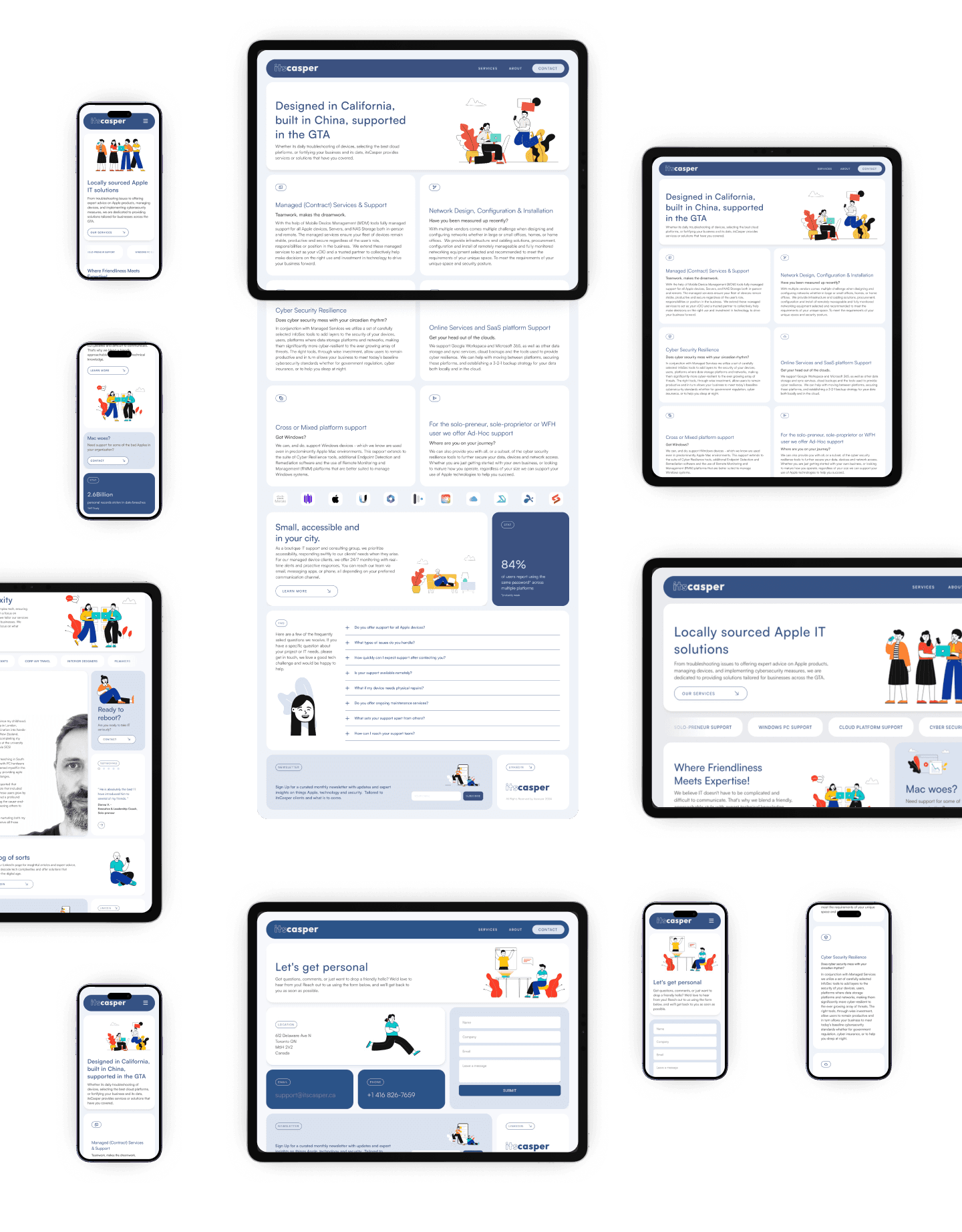
Final thoughts
In the User Journey I discovered that the persona would like to be kept up to date with tech news and the client expressed halfway through the project the intent to create a newsletter. I wish I had incorporated these into the design earlier but was happy to see the bento grid once again prove it’s versatility with it’s flexibility and freedom.
JAKE JONES 2024


