Max Wood Inc.
Conducted UX research for Max Wood's new website to understand user preferences, pain points, and behaviors when exploring high-end furniture and craftsmanship online.
The research gathered insights into user perceptions of bespoke wooden furniture, identifying opportunities to enhance trust, credibility, and engagement across different user groups, including interior designers, prospective clients, and woodworking enthusiasts.
Persona
Empathy map
User journey

How might we?
Sitemap

Wireframe
Adding prices will be difficult as each piece of furniture is custom, but instead we can talk to pricing and push visitors towards contacting the company. Testimonials on each page can be made specific to the page itself, ie. on the 'about' page we can talk to Max Wood's personality and kind nature, whilst on the homepage speak to the craftmanship of the furniture.

Branding
Identity
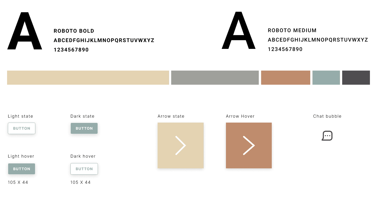
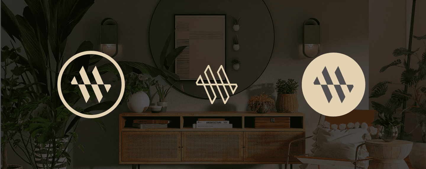
The sharp angles, fused M and W, and clean, lowercase sans-serif convey meticulous craftsmanship and a modern elegance that’s both luxurious and approachable.
Tones
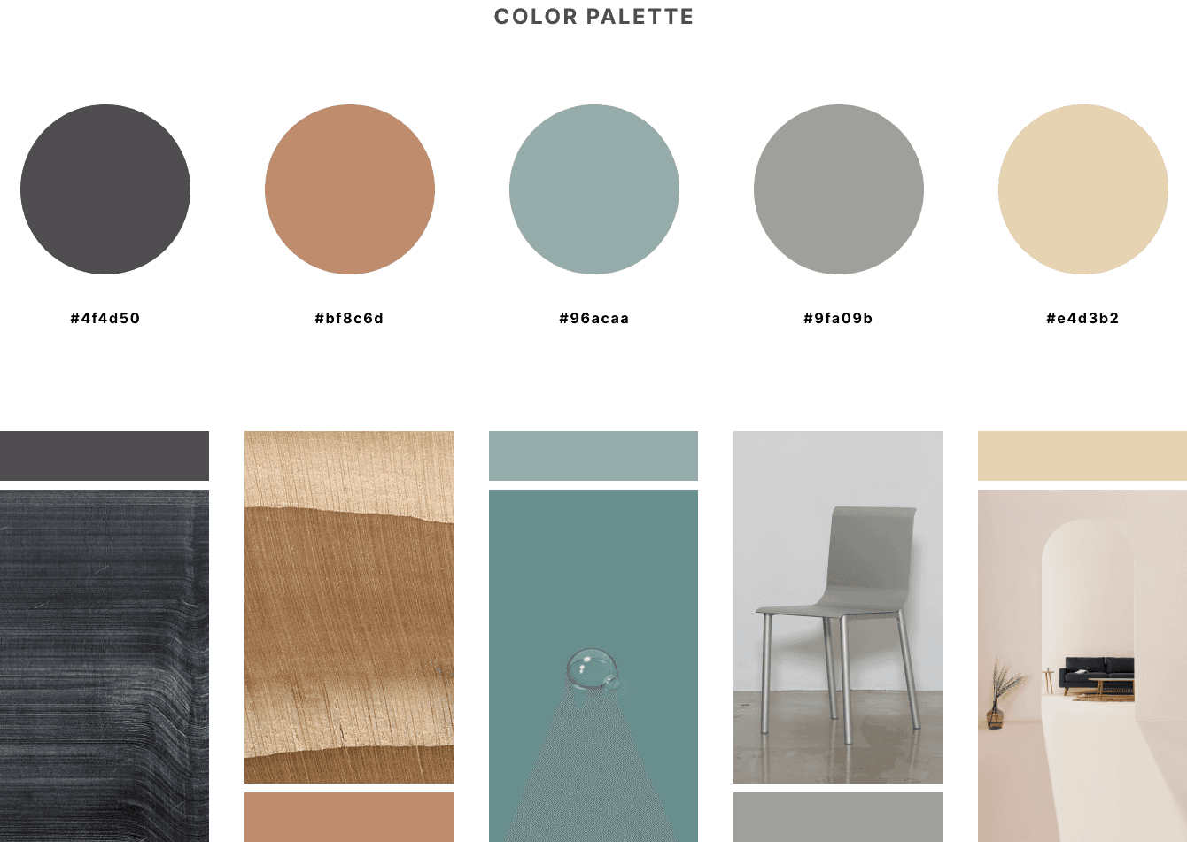
Neutral hues were chosen to reflect the natural materials central to the brand, like wood, stone, and metal, conveying authenticity and timelessness. This earthy palette highlights the brand’s commitment to quality and sustainability.

Mid fid
Design
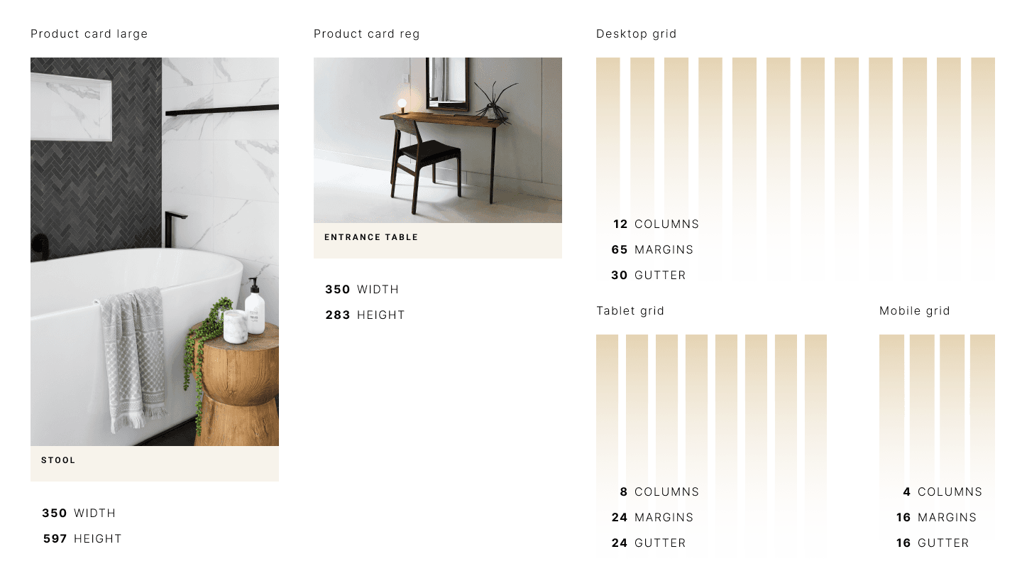
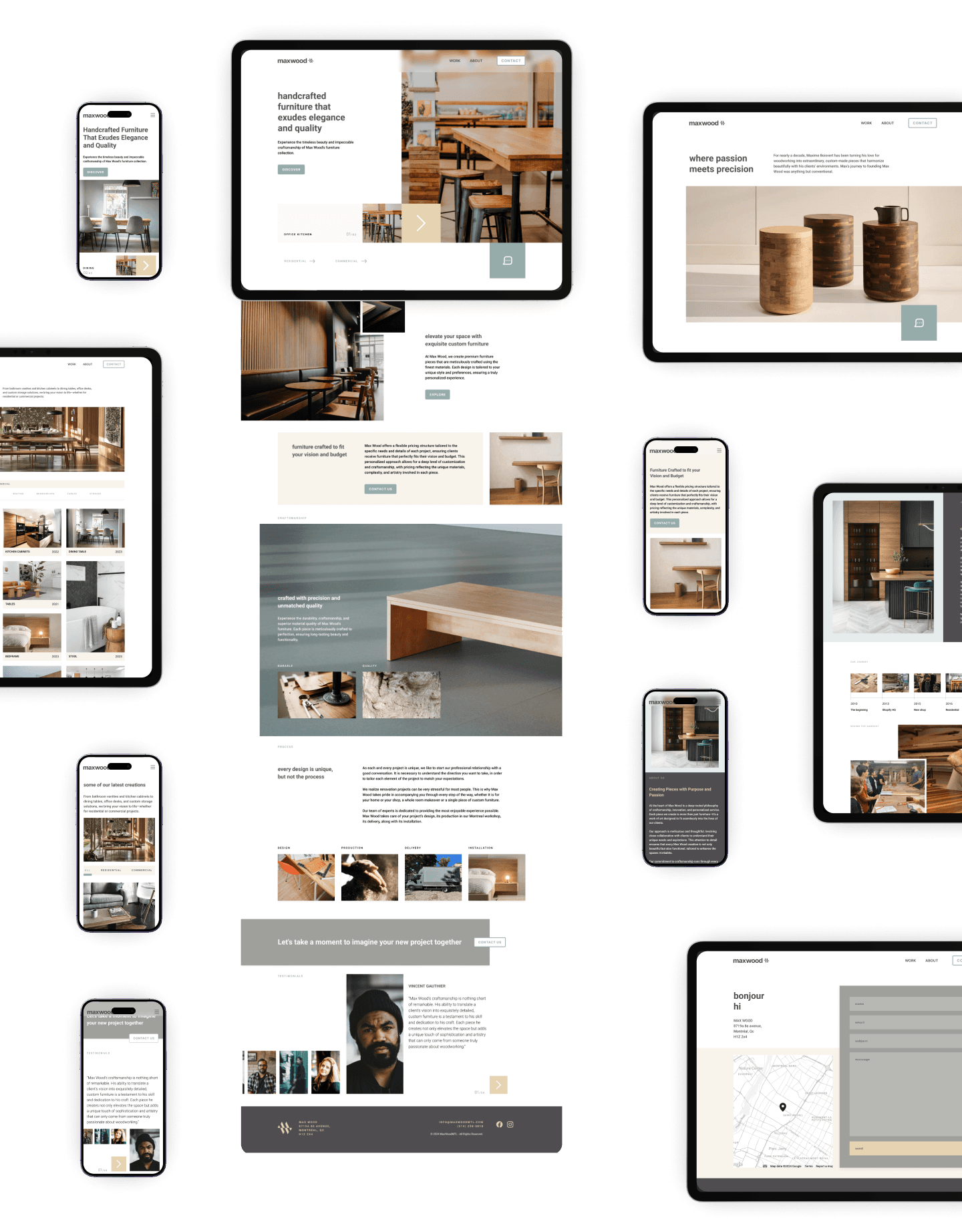
I incorporated horizontal lines to emphasize the craftsmanship behind the furniture, while sharp-cornered images and a structured, rhythmic layout added a sense of refinement. Solid color blocks highlighted essential information, and generous white space with careful padding contributed to a clean, high-end feel. This design approach balances clarity and sophistication, drawing the eye to details that reflect the brand’s dedication to quality.

Usability feedback
The fonts needed to be harmonized, and the colors made consistent to establish a clear information hierarchy and prevent the content from appearing disjointed. The social media icons in the hero section were unnecessary and should be relocated to the footer, where visitors typically expect to find them.
The 'Work' page needed to be the primary call-to-action, as the 'About' section lacked visuals of the furniture and was secondary upon landing on the homepage. The lines throughout the design, though a design element I was initially pleased with, became confusing. I was willing to remove them if they seemed like a "mistake."
Final
Final thoughts
I would potentially simplify the structure and adopt more big and bold imagery to increase the visual appeal.
JAKE JONES 2024


