Nexgen Aviation Inc.

The project aims to enhance Nexgen's website by highlighting its extensive aviation experience and personalized services while ensuring ease of navigation and engagement for users.
Through qualitative interviews with target audience segments such as business travellers and luxury seekers, the research seeks to clarify user preferences, gather feedback on website usability, and identify opportunities to differentiate the company from competitors.
Persona
Empathy map
User journey

How might we?
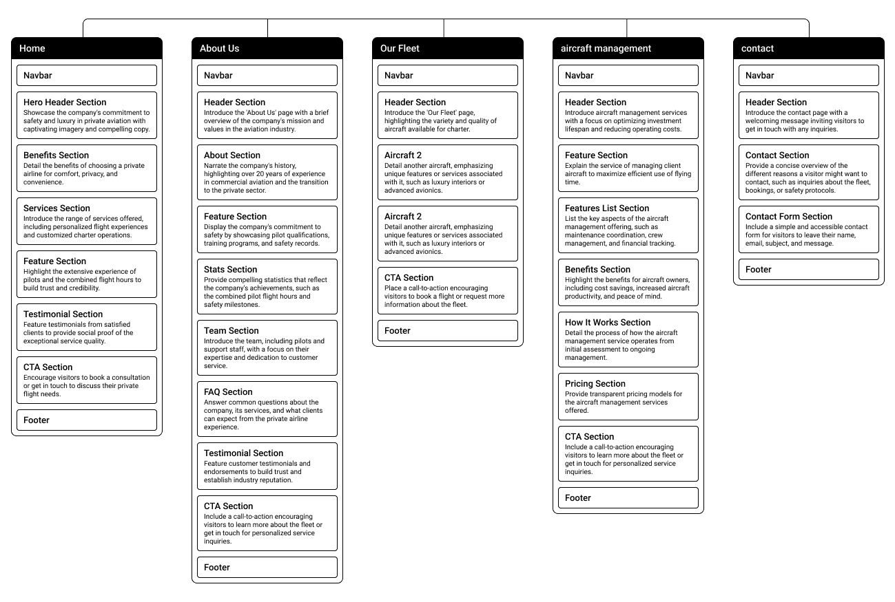
Sitemap

Wireframe
The website will feature extensive information, but throughout the design process, I aim to maintain a minimalistic approach to emphasize the luxury aspect of private air travel.

Branding
Identity
The client wanted to incorporate the Canadian Maple Leaf, so I introduced a modern twist by reimagining it as a dynamic paper plane symbolizing momentum and progress. To complement the icon's sharp, angular design, I chose a bold, uppercase logotype that echoed these angles, projecting strength and confidence. This was balanced by a lowercase subline, adding an approachable, explanatory touch that grounds the brand’s message.
Tones
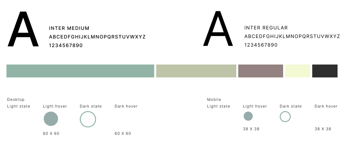
I chose moss green for the aviation branding to evoke a sense of calm, reliability, and connection to nature, which aligns with the brand’s focus on serene and seamless travel experiences. Its earthy undertones subtly suggest sophistication and stability, reassuring clients of a smooth, dependable journey.

#92B4A7
#BDC4A7
#F3F9D2
#93827F
#2F2F2F
Mid fid
Design
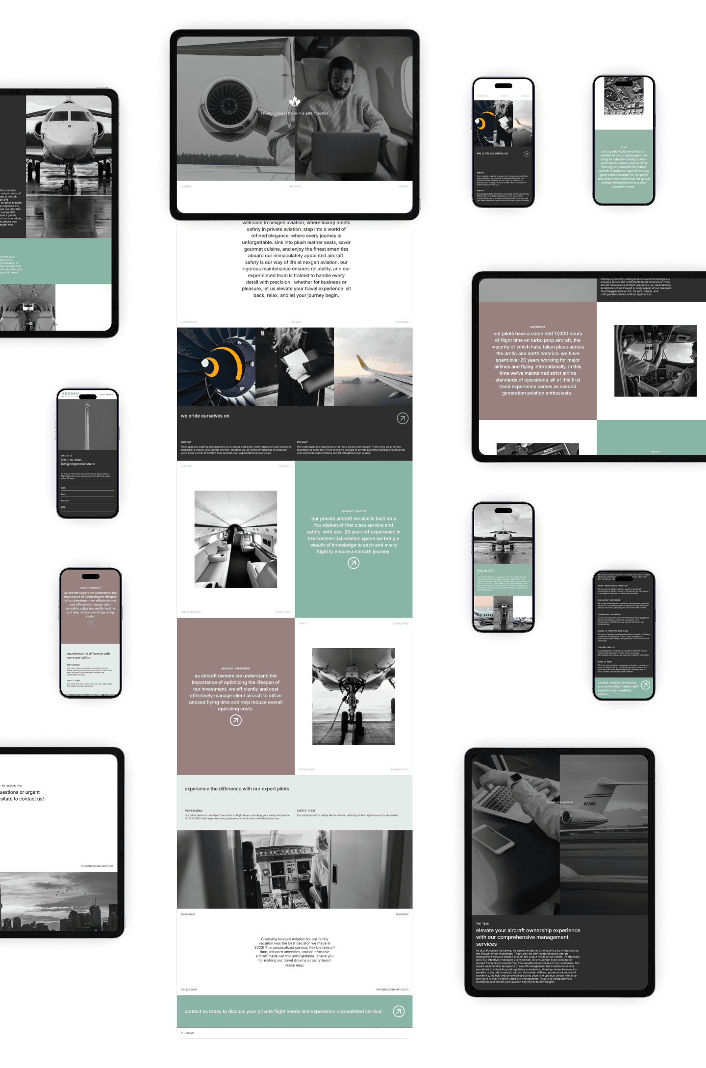
To convey the allure of luxury private air travel, I applied darker hues as overlays on the imagery, adding an air of mystery while ensuring the text stands out prominently. The strategic division of images and color blocks enhances the site’s elegance, creating a visually exotic and elevated experience. By employing tight, clean font sizing, the text maintains a minimalistic yet purposeful appearance, reinforcing the sophisticated atmosphere of the brand.

Usability feedback
The design needs more white space and the color palette needs to be used more sparingly throughout. CTAs were not obvious and overall key information needed to be clearer.
Final

Final thoughts
I believe this design stands out strikingly against the competition, effectively capturing the attention of the target audience. Its high-end, luxurious aesthetic aligns perfectly with the client's vision, creating an immediate and compelling reaction from visitors that conveys exclusivity and sophistication.
JAKE JONES 2024


